第 1 章 画图plot
1.1 箱线图/小提琴图
Code
小提琴图和直方图的组合:(适合分类和数值变量)
Code
p1<-mtcars %>% mutate(am=factor(am,labels = c("automatic","manual")),vs=factor(vs,labels = c('V-shaped', 'straight'))) %>%
ggplot(aes(x=vs,y=mpg,fill=am))+
geom_violin(col="white",trim = FALSE)+
geom_boxplot(width=.3,position=position_dodge(width=0.9))+
theme_bw()+theme(legend.position = c(0.15,0.85))+#图例位置
geom_rug(sides="l", color="black")+
guides(alpha='none')+
labs(x='Name of person',y='Heart rate',title = "Performance on lie detector test",fill="fix lengend")+
scale_fill_brewer(palette="Set2")
p1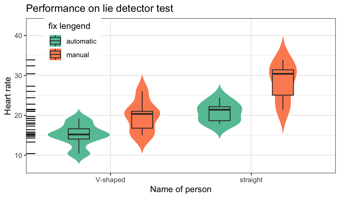
1.2 柱状图
1.2.1 直方图
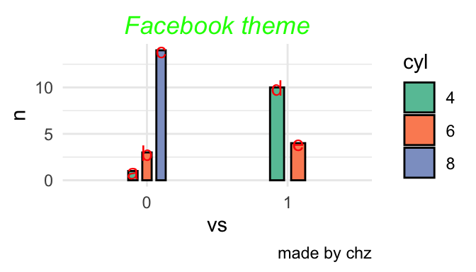
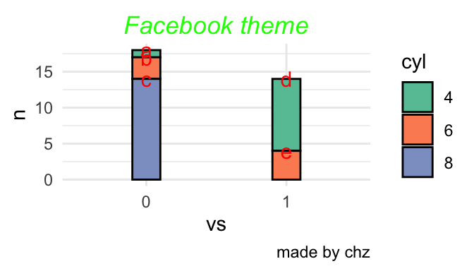
- position 绘制诸如条形图和点等对象的位置。对条形图来说,
- dodge 将分组条形图并排
- stacked 堆叠分组条形图
- fill 垂直地堆叠分组条形图并规范其高度相等(百分比)。
Code
图 1.1: 分类1
1.2.2 条形图
三种位置
Code
p<-mtcars %>% count(vs,cyl) %>% mutate(name=c("a","b","c","d","e")) %>%
mutate_at(c('vs','cyl'),as.factor) %>%#准化某几列
ggplot(aes(x=vs,y=n,fill=cyl,label=name))+
scale_fill_brewer(palette="Set2")+
# scale_fill_manual(values = heat.colors(7))+
# scale_fill_manual(values = terrain.colors(7))+
labs(title="Facebook theme",caption = "made by chz")+
theme_minimal()+
theme(plot.title = element_text(hjust = 0.5,#居中
vjust =0,#上下
color = 'green',
face = "italic")
)
p+geom_bar(stat = "identity",position = 'fill',col=1,width=0.2)+
geom_text(aes(label=name),size=4,vjust=0.5,position = 'fill',col="red")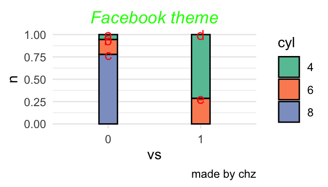
Code
Code
1.3 点线图
- 就是一个点一条线 反应变化幅度和方向
Code
dd<-tibble(name=rep(letters[1:10],2),health=rnorm(20,10,1),time=rep(c('a','n'),each=10))#造一个数据包含每个样本俩个时间段的数据
dd%>%ggplot(aes(x= health, y= name)) +
geom_line(aes(group = name),size = 0.8)+geom_point(aes(fill=time),shape = 21, size = 3,alpha=0.8)+
labs(title="Changes in health on time",x="health", y="name")+
theme(axis.text.y = element_text(size = 5))+theme_bw()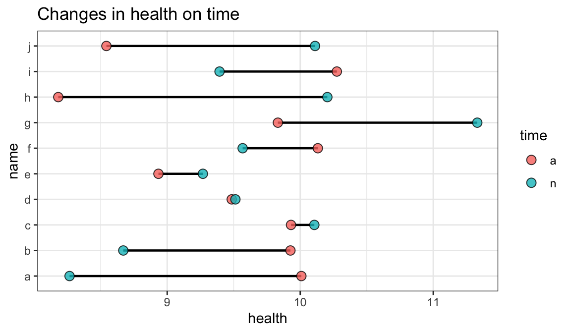
1.4 树图
Code
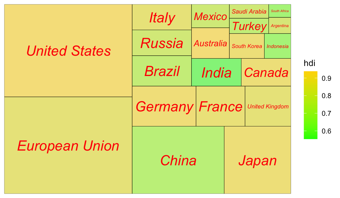
1.4.1 次级分组(亚群):
Code
ggplot(G20, aes(area = gdp_mil_usd, fill = hdi, label = country,subgroup = region)) +
geom_treemap() +
geom_treemap_subgroup_border() +
geom_treemap_subgroup_text(place = "centre", grow = T,
alpha = 0.5, colour ="black", fontface = "italic", min.size = 0) +
geom_treemap_text(colour = "green", place = "topleft", reflow = T,alpha=.8)+
scale_fill_distiller(palette="Reds")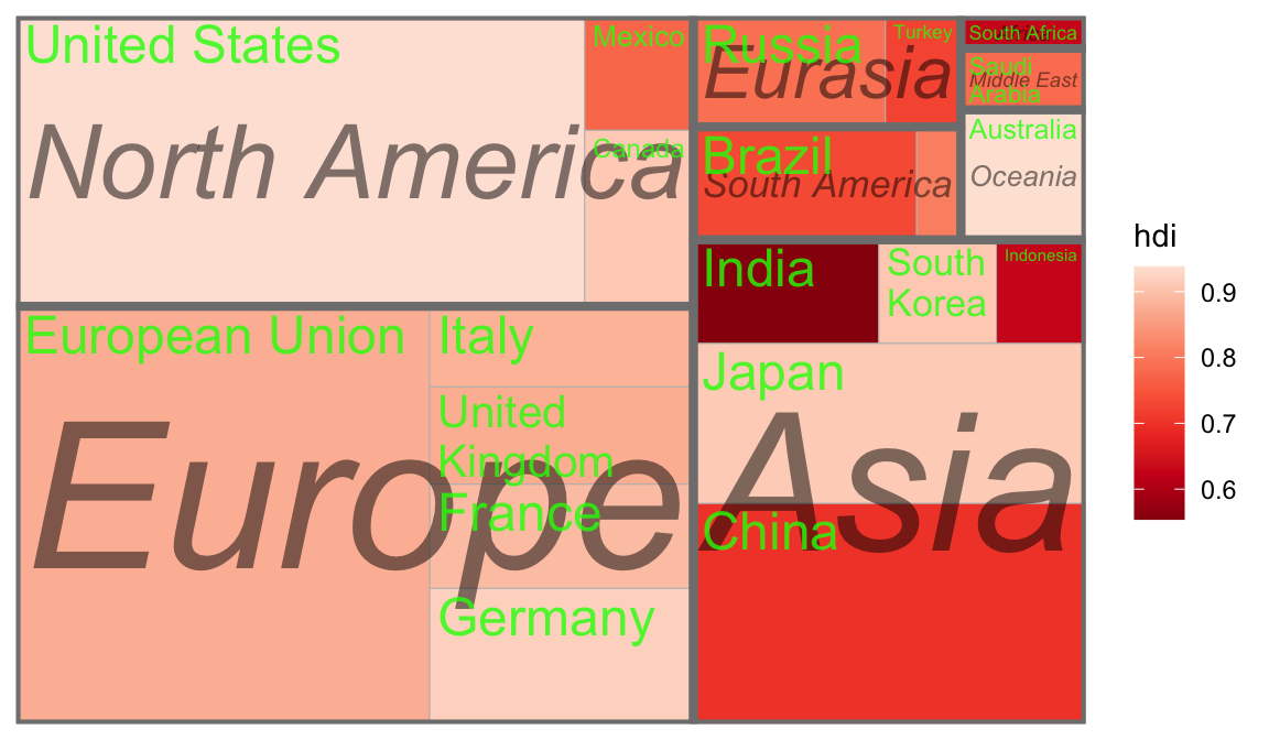
1.5 交互图
1.5.2 plotly 3D玫瑰
http://www.rebeccabarter.com/blog/2017-04-20-interactive/ https://plotly.com/r/
Code
x<- seq(0, 24) /24
t <- seq(0, 575, by = 0.5) / 575*20 *pi + 4 *pi
grid <- expand.grid(x = x, t = t)
x <- matrix(grid$x, ncol = 25, byrow = TRUE)
t <- matrix(grid$t, ncol = 25, byrow = TRUE)
p<- (pi/2)*exp(-t/(8*pi))
change <- sin(15 * t) /150
u<-1-(1-(3.6*t)%%(2*pi) /pi)^4/2+change
y <- 2*(x^2- x)^2* sin(p)
r<- u*(x*sin(p) +y *cos(p))
xx=r*cos(t)
yy=r*sin(t)
zz=u*(x*cos(p)-y*sin(p))#花的平面参数,不晓得哪位大神计算的
plot<-plot_ly(x = ~xx, y = ~yy, z = ~zz,color = ~zz,
colors = 'Reds',opacity = 0.5,showscale = FALSE) %>% add_surface()
add_trace(plot,x=rep(0,4),y=rep(0,4),z=seq(-0.5,0,length=4), mode='lines', line = list(color = 'green', width = 8)) %>% add_text(x=0,y=0,z=1,text="plot by chz",list(color = 'green', size = 8)) %>% config(displaylogo = FALSE) %>%
layout(title = "玫瑰花 using Plotly",
xaxis = list(showgrid = FALSE),
yaxis = list(showgrid = FALSE),
showlegend = FALSE)1.6 自定义图片
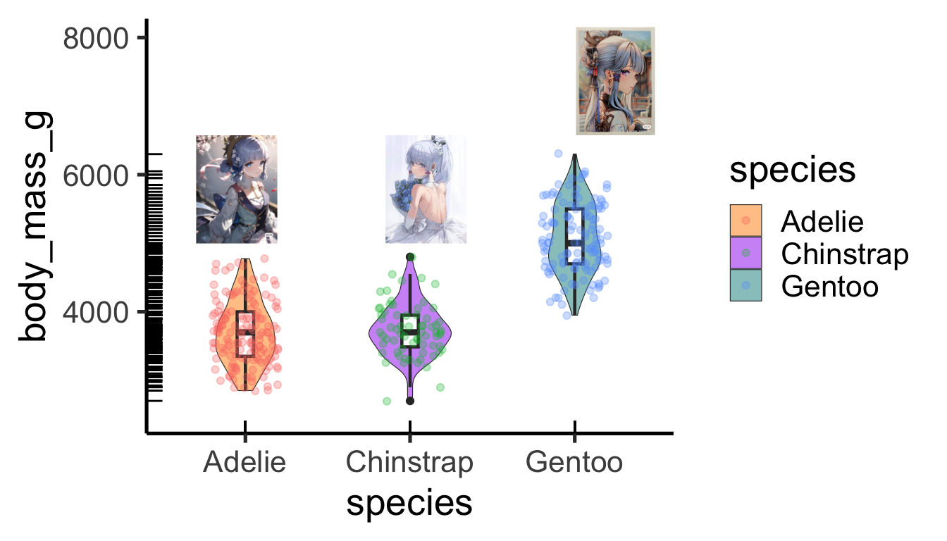
Code
library(magick)
library(grid)
library(ggplot2)
# install.packages("palmerpenguins")
library(palmerpenguins)
p<-ggplot(penguins,aes(x = species, y = body_mass_g)) +
geom_violin(width=0.5,cex=0.2,aes(fill = species),alpha=0.5) +
geom_boxplot(width=0.1,cex=0.8)+
geom_jitter(width = 0.2,alpha=0.3,aes(col = species))+
geom_rug()+
scale_y_continuous(limits = c(2500,8000))+
theme_classic(base_size = 20) +
scale_fill_manual(values = c("darkorange","purple","cyan4"))原图然后根据位置加到图上
Code
- 点换成图标
Code
library(png) #读取.png图片
library(jpeg) #读取jpeg图片
library(grid)
library(ggimage) #ggplot2扩展包,配合ggplot2绘图
t=seq(0, 2*pi, by=0.2)
x=16*sin(t)^3
y=13*cos(t)-5*cos(2*t)-2*cos(3*t)-cos(4*t)
a=(x-min(x))/(max(x)-min(x))
b=(y-min(y))/(max(y)-min(y))
bg_img <- image_read('www/bg.png')
bees <- data_frame(x=a,y=b)
bees$image <- rep(c("www/dc.png"),times=32)
ggplot(data = bees, aes(x = x, y = y))+
theme_bw(base_size = 20)+
annotation_custom(rasterGrob(bg_img,
width = unit(1,"npc"),
height = unit(1,"npc")),
-Inf, Inf, -Inf, Inf)+
geom_image(aes(image = image), size = 0.1)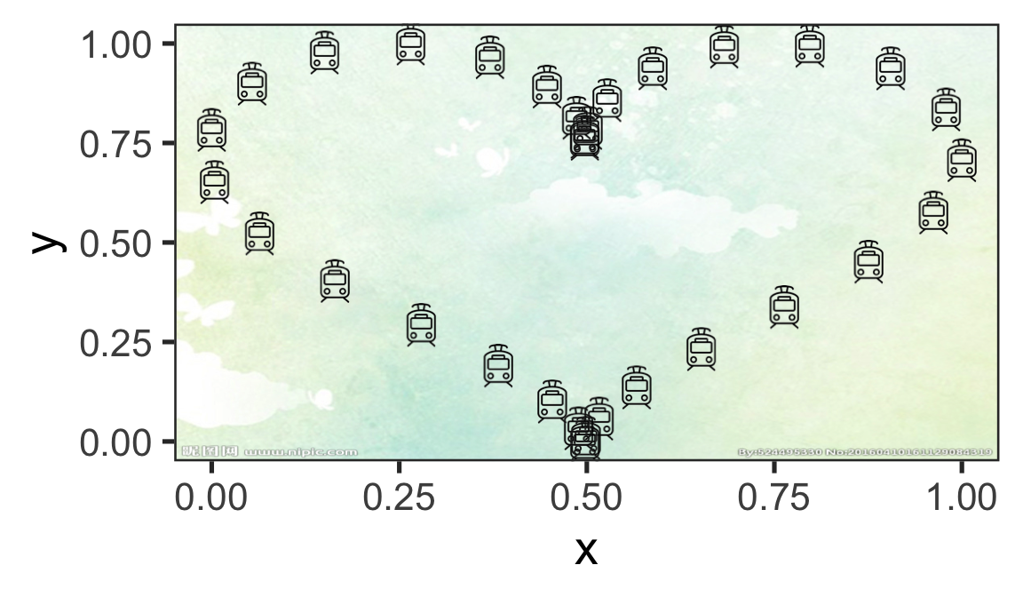
1.7 时间动态图
Code
library(patchwork)
a=rep(2000:2019,each=2)
b=10*(a-2000)+rnorm(40,10,10)
mydat=tibble(a=a,b=b,c=sample(c('a','b'),40,replace = T))
p1<-ggplot(mydat,aes(x=a,y=b,col=c,group=c))+
geom_line()+geom_point()+theme_bw()
p2<-ggplot(mydat,aes(x=c,y=b,fill=c,group=c))+
geom_violin(col="white",trim = FALSE)+
geom_boxplot(width=.3,position=position_dodge(width=0.9))+
theme_bw()+theme(legend.position = c(0.15,0.85))+#图例位置
geom_rug(sides="l", color="black")+
guides(alpha='none')+
labs(x='Name of person',y='Heart rate',title = "Performance on lie detector test",fill="fix lengend")+
scale_fill_brewer(palette="Set2")
pp<-(p1/plot_spacer())|p2
pp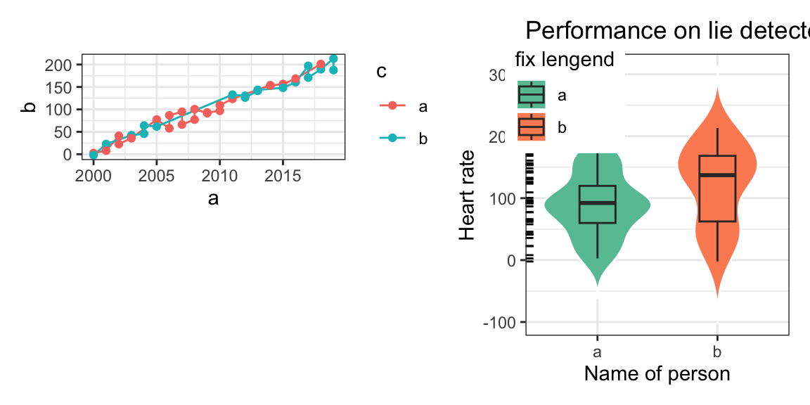
plotly不太适配,测试组合plotly图
1.8 流程图
Code
library(DiagrammeR)
grViz("
digraph {
# initiate graph
graph [layout = dot, rankdir = LR, label = '研究路线\n\n',labelloc = t]
# global node settings
node [shape = rectangle, style = filled, fillcolor = Linen]
A[label = '数据', shape = folder, fillcolor = Beige]
B[label = '预处理-\n选取,整合变量']
C[label = '欠采样\n 类别不平衡样本']
D[label = '朴素贝叶斯']
E[label = '逻辑回归']
F[label = '神经网络']
G[label= 'gbm梯度提升']
H[label= 'gbm提升模型\n参数优化']
P[label= '1.准确率 \n 2.重要性 \n 3.ROC曲线']
MOD[label= '最终模型',fillcolor = Beige]
blank1[label = '', width = 0.01, height = 0.01]
# A -> blank1[dir=none];
# blank1 -> B[minlen=10];
# {{ rank = same; blank1 B }}
# blank1 -> C
# blank2[label = '', width = 0.01, height = 0.01]
# C -> blank2[dir=none];
# blank2 -> D[minlen=1];
# {{ rank = same; blank2 E }}
# blank2 -> E [minlen=10]
A->B
{{ rank = same; A B }}
B->C
C->{D,E,F,G}
{D,E,F,G}->P
subgraph cluster_modules {
label = '模型构建'
color = red
style = dashed
# connect moderator to module 4
{D,E,F,G}
}
P->H
subgraph cluster_moderator {
label = '模型评估'
color = red
style = dashed
P}
H->MOD
{{ rank = same;H MOD }}
}
")
1.9 地图
leaflet
1.9.1 天心区
Code
df <- sp::SpatialPointsDataFrame(
cbind(
(runif(4,-0.5,0.5))/2 + 112.99, # lng
(runif(4,-0.5,0.5))/2 + 28.11 # lat
),
data.frame(type = factor(
rep(c("pirate", "ship"),2),
c("ship", "pirate")
))
)
oceanIcons <- iconList(
ship = makeIcon(iconUrl = "www/lp_lh1.png",
iconWidth =50, iconHeight = 50),
pirate = makeIcon(iconUrl = "www/lp_lh2.png",
iconWidth =50, iconHeight = 50)
)Code
m<-leaflet() %>%
addTiles(group = "OSM (default)") %>%
setView(112.99, 28.11, zoom = 10) %>%
addMarkers(112.99, 28.11, popup="The birthplace of R",
group = "1") %>%
addCircleMarkers(112.99, 28.11,radius = 10, color = c('red'),
group = "2") %>%
addCircles(112.99, 28.11,weight = 3,radius = 10000, color = c('red'),group = "3") %>%
addRectangles(
lng1=113.2, lat1=28.3,lng2=112.8, lat2=27.9,fillColor = "yellow",group = "4") %>%
addMarkers(data=df,icon = ~oceanIcons[type],clusterOptions = markerClusterOptions(),group = "5") %>%
addLayersControl(
baseGroups = c("OSM (default)"),
overlayGroups = c("1", "2","3", "4","5"),
options = layersControlOptions(collapsed = T,autoZIndex = TRUE)
)
m
1.10 生物解剖{wu-liu-bing-bing}
https://github.com/jespermaag/gganatogram
Code
organPlot <- data.frame(organ = c("heart", "leukocyte", "nerve", "brain", "liver", "stomach", "colon"),
type = c("circulation", "circulation", "nervous system", "nervous system", "digestion", "digestion", "digestion"),
colour = c("red", "red", "purple", "purple", "orange", "orange", "orange"),
value = c(10, 5, 1, 8, 2, 5, 5),
stringsAsFactors=F)
gganatogram(data=organPlot, fillOutline='#a6bddb', organism='human', sex='female', fill="colour")+theme_void()
Code
Code
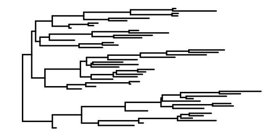
1.11 ggtree
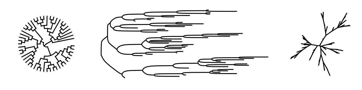
- rtree is a simple and convenient way to generate a tree
- ggtree used to visualize the organized tree
This is the most basic diagram, containing only structural information,the root node is on the left, and the children are on the right.
1.11.1 More forms of phylogenetic tree
Arguments in function
Its arguments can be divided into three categories: data arguments, plotting arguments, and theme arguments. Here, I pick a few important parameters:
tree: A required argument that specifies the evolutionary tree object.layout: An optional argument that specifies the layout of the evolutionary tree.branch.length: An optional argument that specifies whether to display the branch lengths.layout.legend.position: An optional argument that specifies the position of the legend. The default is “right”.geom_tiplabfor adding taxa labelgeom_nodepoint(),geom_tippoint()for adding nodes
Try to change some arguments
The ggtree package inherits the advantages of ggplot2. Users can change the color, size, and type of the lines as we do with ggplot2.

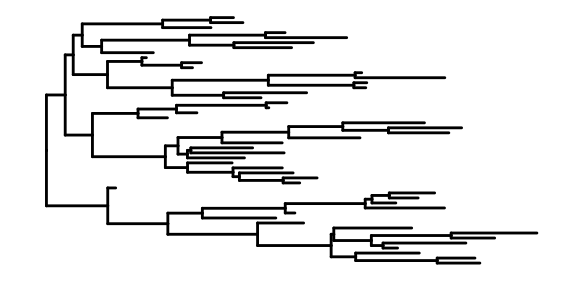
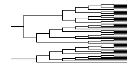
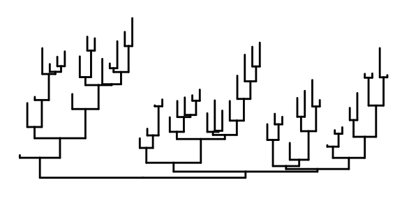
We also can specify the layouts style of tree.
Code
Displaying nodes and labels The labels on the nodes, each label representing an individual.
Code

Code

1.11.2 run with another dataset
In Yu’s book, he introduced ggtree for Phylogenetic Tree Objects. I chose to study iris data from R built-in data.
Data:iris
This famous (Fisher’s or Anderson’s) iris data set gives the measurements in centimeters of the variables sepal length and width and petal length and width, respectively, for 50 flowers from each of 3 species of iris. The species are Iris setosa, versicolor, and virginica.(from help documentation of iris)
## Sepal.Length Sepal.Width Petal.Length Petal.Width
## 1 5.1 3.5 1.4 0.2
## 2 4.9 3.0 1.4 0.2
## 3 4.7 3.2 1.3 0.2
## Species
## 1 setosa
## 2 setosa
## 3 setosaThe data contain one hundred fifty flowers and four characteristic variables and an indicator of a flower category
## [1] 150 5hclust: Hierarchical clustering combines samples continuously according to the distance between them, and its results are similar to the dendrogram in our study
Code
##
## Call:
## hclust(d = .)
##
## Cluster method : complete
## Distance : euclidean
## Number of objects: 150Code
## 'dendrogram' with 2 branches and 150 members total, at height 7.085Code
# The results are divided into three categories, considering that we have three species
clus <- cutree(hc, 3)
g <- split(1:length(clus), clus)
# plot a simple graph by ggtree
p <- ggtree(hc,size = 0.5,linetype=6)
clades <- sapply(g, function(n) MRCA(p, n))
# groupClade:The color of the branches is displayed according to the classification results
# This is based on the results of cluster analysis,
# the samples on the same color branches have similar characteristics
p <- groupClade(p, clades, group_name='group') + aes(color=group)
p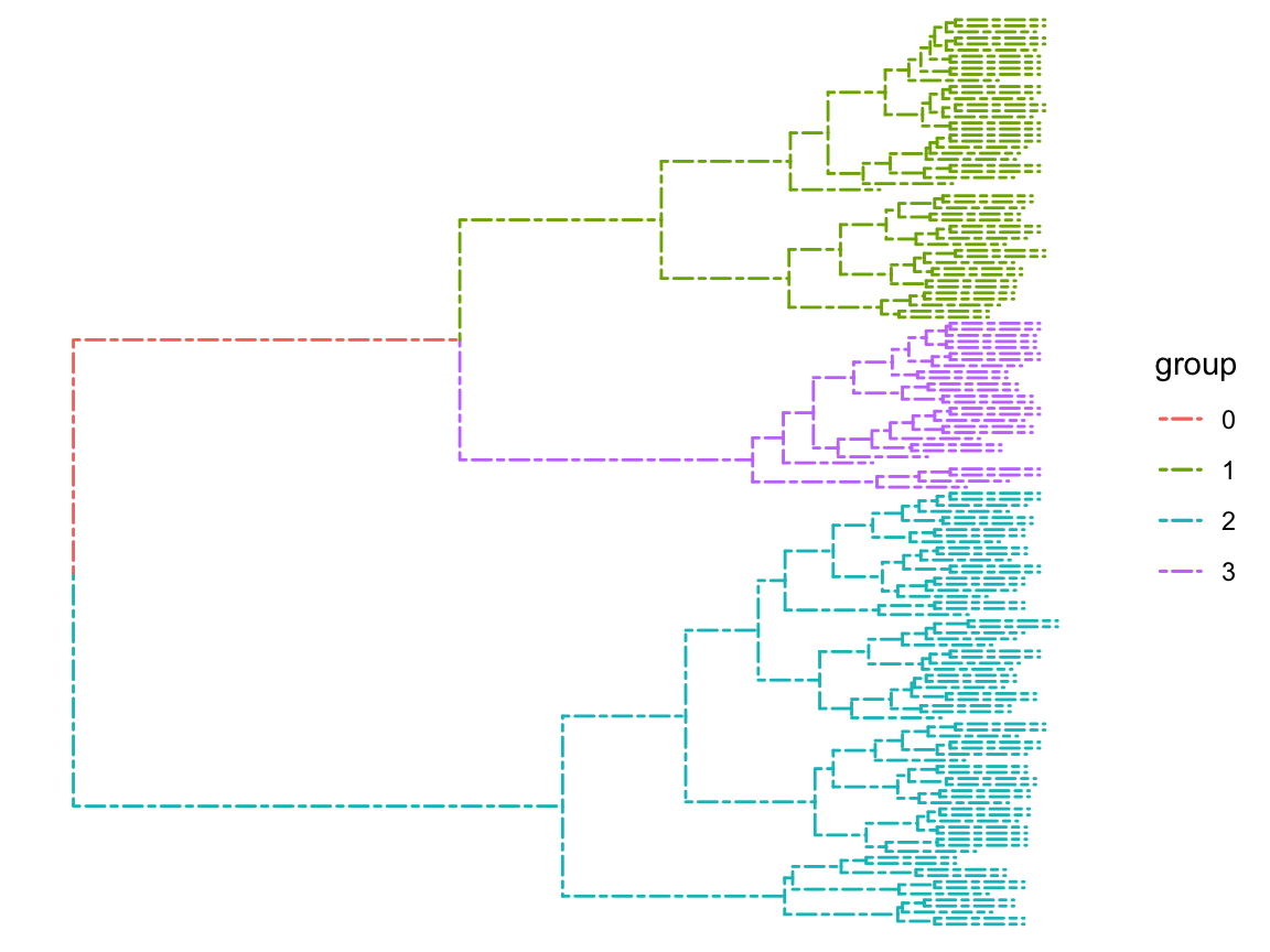
Code
# labs can write the unique label of the sample,
# but this data set does not, because the sample is a lot of flowers,
# we do not consider a single individual,
# but like in our study of city level classification, we can write lab.
d <- data.frame(label =c(1:nrow(iris)),
Species = iris[,"Species"])- layout_dendrogram() to layout the tree top-down, and theme_dendrogram() to display tree height.
- %<+%be similar to %>%
- geom_tippoint:Sets the shape and color of the end node
Code
p<-p %<+% d +
layout_dendrogram() +
geom_tippoint(aes(fill=Species, x=x+.5),
size=2, shape=21, color='black')+
geom_tiplab(aes(label=Species), cex=0.5,size=1, hjust=.5, color='black') +
geom_tiplab(angle=90, hjust=1, cex=0.5,size=1, offset=-2, show.legend=FALSE) +
scale_color_brewer(palette='Set1', breaks=1:4) +
theme_dendrogram(plot.margin=margin(6,6,80,6)) +
theme(legend.position=c(.95, .75),
legend.background = element_rect(
size = 0.2 ),legend.text=element_text(size=2),
legend.title=element_text(size=2))+labs(title = "Dendrogram of the clustering results")
p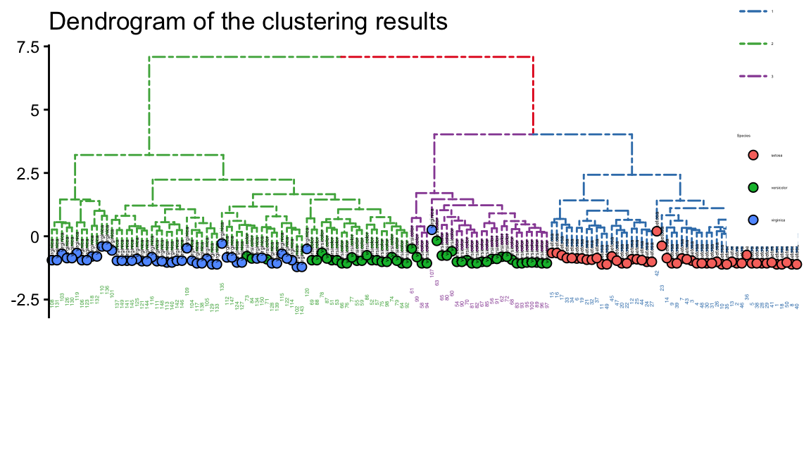
theme_tree: Add background,may Green Be Good for your eyesight?
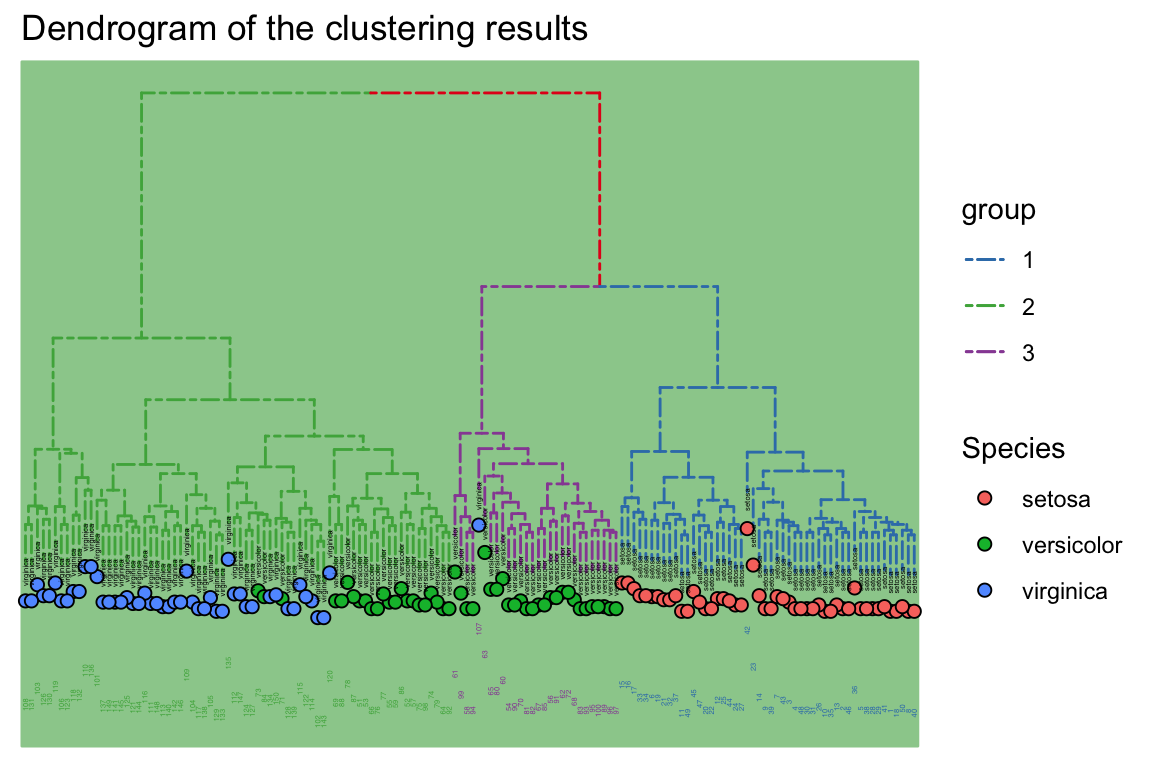
Do it by another way
Code
p=ggtree(hc,size = 0.8,linetype='dashed', layout="circular") %>%
groupClade(clades, group_name='group') + aes(color=group)
p<-p %<+% d +
geom_tippoint(aes(fill=Species, x=x+.5),
size=2, shape=21, color='black')+geom_tiplab(aes(label=Species), cex=0.8,size=1, hjust=.5, color='black') +
geom_tiplab(angle=90, hjust=1, cex=0.5,size=2, offset=-2, show.legend=FALSE) +
scale_color_brewer(palette='Set1', breaks=1:4) +
theme_dendrogram(plot.margin=margin(6,6,80,6)) +
theme(legend.position=c(.95, .75),
legend.background = element_rect(
size = 0.5 ),legend.text=element_text(size=5),
legend.title=element_text(size=5))+labs(title = "Dendrogram of the clustering results")+theme_tree("#FEE4E9")
p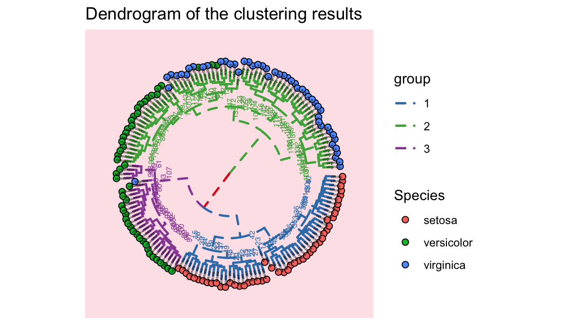
1.12 颜色ggplot
scale_fill_brewer(palette = "Set1")
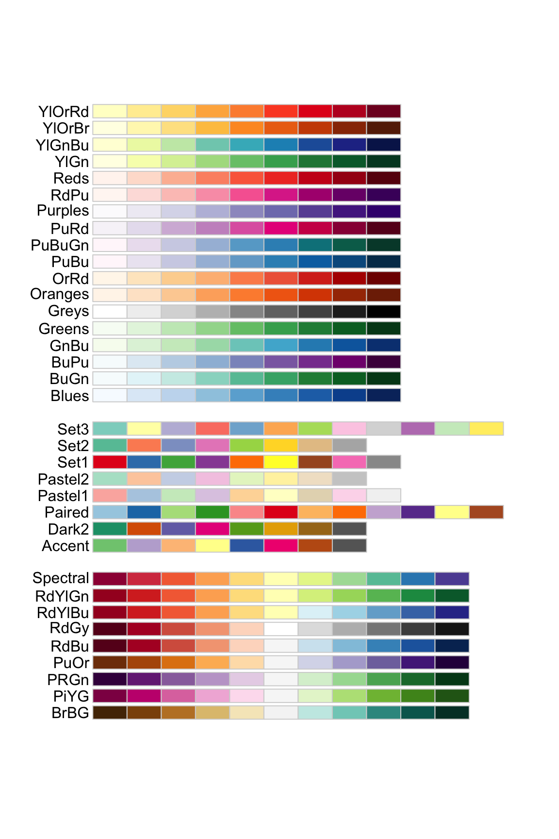
## [1] "#FF0000" "#FF8000" "#FFFF00" "#80FF00" "#00FF00"
## [6] "#00FF80" "#00FFFF" "#0080FF" "#0000FF" "#8000FF"
## [11] "#FF00FF" "#FF0080"scale_color_gradient 双色渐变(低-高).
scale_color_gradient2 发散颜色渐变(低-中-高).
scale_color_gradientn 创建n色渐变.
scale_fill_manual(values=c(c = "red", d = "blue", e = "green" , p = "orange", r = "yellow"))
1.13 仪表盘图highcharter
Code
library(highcharter)
library(dplyr)
library(viridisLite)
library(forecast)
library(treemap)
library(arules)
library(flexdashboard)
thm <-
hc_theme(
colors = c("#1a6ecc", "#434348", "#90ed7d"),
chart = list(
backgroundColor = "transparent",
style = list(fontFamily = "Source Sans Pro")
),
xAxis = list(
gridLineWidth = 1
)
)1.13.2 Sales by State
Code
data("USArrests", package = "datasets")
data("usgeojson")
?usgeojson
USArrests <- USArrests %>%
mutate(state = rownames(.))
n <- 4
colstops <- data.frame(
q = 0:n/n,
c = substring(viridis(n + 1), 0, 7)) %>%
list_parse2()
highchart() %>%
hc_add_series_map(usgeojson, USArrests, name = "Sales",
value = "Murder", joinBy = c("woename", "state"),
dataLabels = list(enabled = TRUE,
format = '{point.properties.postalcode}')) %>%
hc_colorAxis(stops = colstops) %>%
hc_legend(valueDecimals = 0, valueSuffix = "%") %>%
hc_mapNavigation(enabled = TRUE) %>%
hc_add_theme(thm)1.13.3 Sales by Category
Code
data("Groceries", package = "arules")
dfitems <- tbl_df(Groceries@itemInfo)
set.seed(10)
dfitemsg <- dfitems %>%
mutate(category = gsub(" ", "-", level1),
subcategory = gsub(" ", "-", level2)) %>%
group_by(category, subcategory) %>%
summarise(sales = n() ^ 3 ) %>%
ungroup() %>%
sample_n(31)
tm <- treemap(dfitemsg, index = c("category", "subcategory"),
vSize = "sales", vColor = "sales",
type = "value", palette = rev(viridis(6)))
hctreemap(tm, allowDrillToNode = TRUE, layoutAlgorithm = "squarified") %>%
hc_add_theme(thm)